<< Previous section: Diagrams (Relational) | Main Table of Contents | Next: Section F (Maps) >>
Table of Contents for Section E
E. Graphs
Graphs
1. Bar Graphs
1a. Vertical Bar Graphs
© NCAM 2009
Guidelines:
- Bar graphs should be converted into accessible tables.
- Briefly describe the graph and give a summary if one is immediately apparent.
- Provide the title and axis labels.
- It is not necessary to describe the visual attributes of the bars, e.g. dark blue, light blue, unless there is an explicit need such as an exam question referring to the colors.
Description:
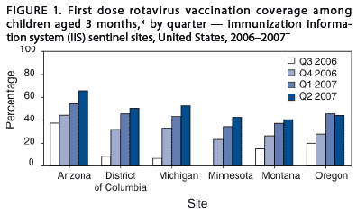
Figure 1 is a bar graph that measures percentage of vaccination coverage in five states over one year, from Q3 2006 to Q2 2007. In each state, the coverage increases over time. The data are summarized in the following table. All data are approximate.| blank space | Arizona | District of Columbia | Michigan | Minnesota | Montanta | Oregon |
|---|---|---|---|---|---|---|
| Q3 2006 | 35% | 10% | 5% | 0% | 15% | 20% |
| Q4 2006 | 45% | 30% | 33% | 25% | 27% | 27% |
| Q1 2007 | 50% | 45% | 42% | 35% | 37% | 45% |
| Q2 2007 | 65% | 48% | 50% | 41% | 40% | 44% |
Return to main table of contents | Return to top of page | Next
1b. Horizontal Bar Graphs
© NCAM 2009
Guidelines:
- While most bar graphs should be converted into accessible tables, this simple chart can also be presented as text in a list.
- Provide the title and labels.
- It is not necessary to describe the visual attributes of the bars unless there is an explicit need.
Description
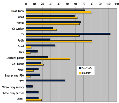
The figure is a bar graph that has been converted into the following table. All data are approximate. How people who are deaf, hard-of-hearing, blind or have low vision are alerted to emergencies.| Response | Deaf/Hard of Hearing | Blind/Low Vision |
|---|---|---|
| Don’t know | 70 | 79 |
| Friend | 59 | 62 |
| Family | 65 | 64 |
| Co-worker | 33 | 38 |
| TV | 102 | 65 |
| Radio | 30 | 80 |
| 36 | 5 | |
| Web | 16 | 4 |
| Landline Phone | 25 | 53 |
| Cellphone | 8 | 11 |
| Pager | 17 | 10 |
| Smartphone/PDA | 18 | 8 |
| TTY | 47 | 0 |
| Video Relay Service | 4 | 0 |
| Phone Relay Service | 8 | 0 |
| Other | 7 | 9 |
Return to main table of contents | Return to top of page | Next
1c. Double Bar Graphs
© Harcourt 2008
Guidelines:
- Explain the data on the x-axis and the y-axis and summarize the overall trend.
- List the data in bullet form.
- Use the appropriate vocabulary in context with the surrounding text depending upon depending on age/grade level. (For example, using the word “about” and not “approximately” for a lower grade level, and is consistent with surrounding text.)
- Although the bars on the chart reach approximate numbers, giving specific numbers makes it less wordy and more meaningful.
Description:
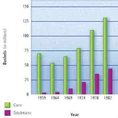
A double bar graph shows corn and soybeans crops harvested from 1959 to 1982 in millions of bushels. Both crops increase steadily from 1964 and there are consistently many more bushels of corn harvested than soybeans.- 1959: corn, about 65; soybeans, about 5.
- 1964: corn, about 55; soybeans, about 6.
- 1969: corn, about 60; soybeans, about 10.
- 1974: corn, about 77; soybeans, about 23.
- 1978: corn, about 110; soybeans, about 36.
- 1982: corn, about 130; soybeans, about 60.
Return to main table of contents | Return to top of page | Next
2. Line Graphs
© NCAM 2009
Guidelines:
- Line graphs should be converted into accessible tables.
- Briefly describe the chart and give a summary if one is immediately apparent.
- Provide the title and axis labels.
- It is not necessary to describe the visual attributes of the lines, e.g. solid, dashed, unless there is an explicit need such as an exam question referring to these attributes. In this case, with just two lines, the added description is not a burden to the reader.
Description:
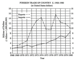
The figure is entitled “FOREIGN TRADE OF COUNTRY X, 1968 through 1980, in United States dollars”. There are two lines on the graph, a dashed line labeled “Exports” and a solid line labeled “Imports”.The vertical axis is labeled “Billions of Dollars,” beginning with zero to eighteen, in increments of 2. A note: one billion equals a one followed by 9 zeros.The horizontal axis is labeled “Year” and lists all the years from 1968 through 1980.In the graph, the Exports line begins in 1968 at 3 billion dollars, rises steeply to 14 billion in 1974, then drops to 9.5 billion in 1975 and 1976. In 1977, the Exports line shoots up to 15.5 billion, then trails off to 10 billion in 1980.In the graph, the Imports line begins in 1968 at 2 billion and rises steadily to 8.75 billion in 1980, except for minor dips in 1972 and 1979.The data are summarized in the following table. Figures are in billions of dollars. All data are approximate.
FOREIGN TRADE OF COUNTRY X
| Year | Exports | Imports |
|---|---|---|
| 1968 | 3 | 2 |
| 1969 | 3 | 2.3 |
| 1970 | 4 | 2.4 |
| 1971 | 5 | 3.1 |
| 1972 | 10 | 2.5 |
| 1973 | 13 | 3.3 |
| 1974 | 14.2 | 3.7 |
| 1975 | 9.7 | 4 |
| 1976 | 9.5 | 5 |
| 1977 | 15.5 | 5.7 |
| 1978 | 12.5 | 7 |
| 1979 | 12 | 6.3 |
| 1980 | 10.2 | 8.6 |
Return to main table of contents | Return to top of page | Next
3. Pie Graphs
© NCAM 2009
Guidelines:
- Pie graphs should be converted into accessible tables.
- It is not necessary to describe the visual attributes of the charts, e.g., red wedge, blue lines, etc., unless there is an explicit need such as an exam question referring to these attributes.
- It is helpful to list the numbers from smallest to largest, regardless of how they are presented in the image.
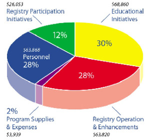
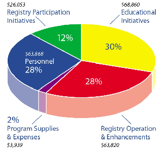
Description:
This figure is a pie graph that can be shown in the following table.| Expense | Percent of Total | Dollar Amount |
|---|---|---|
| Program Supplies and Expenses | 2% | $3,939 |
| Registry Participation Initiatives | 12% | $26,052 |
| Registry Operation and Enhancements | %28 | $63,820 |
| Personnel | 28% | $63,868 |
| Educational Initiatives | 30% | $68,860 |
Return to main table of contents | Return to top of page | Next
4. Scatter Plots
© NCAM 2009
Guidelines:
- Scatter plots are among the more difficult graphs to describe, especially if there is a need to make specific data point accessible.
- Provide the title and axis labels.
- Identify the image as a scatter plot and focus on the change of concentration.
- If it is necessary to be more specific, convert the data into an accessible table.
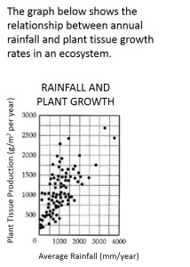
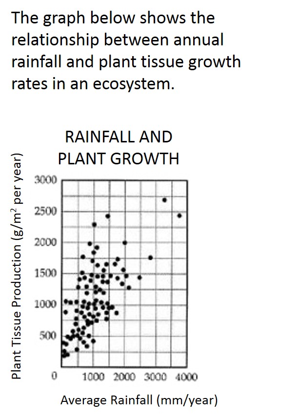
Description:
The graph is a scatter plot, entitled “Rainfall and Plant Growth.”The horizontal X axis shows Average Rainfall ranging from zero to four thousand, in units of millimeters per year, in increments of one thousand.The vertical Y axis shows Plant Tissue Production in units of grams per meter squared per year, ranging from zero to three thousand, in increments of five hundred.The graph has approximately 85 points scattered in a pattern beginning in the lower-left corner where Plant Tissue Production and Average Rainfall are the lowest. The pattern extends toward the upper-right corner where Plant Tissue Production and Average Rainfall are the highest.The majority of points are concentrated in the lower-left corner and diminish in concentration as the pattern extends toward the upper-right corner.<< Previous: Section D (Diagrams: Relational) | Return to main table of contents | Return to top of page | Next: Section F (Maps) >>