Accessible Data Visualizations
What are Data Visualizations?
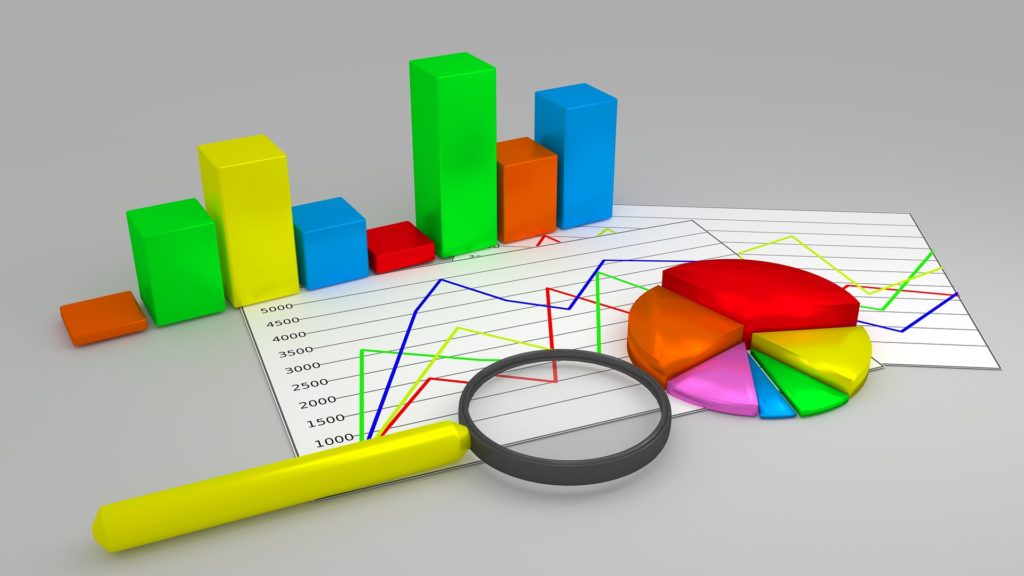
Data visualization is a general term for information conveyed through the use of graphics or images. Usually, this means data charts, like bar charts, pie charts, line graphs, scatter plots, or more complicated charts like bubble charts or parallel coordinate plots. But it also means timelines, diagrams, flowcharts, organizational charts, maps, and so on.
Data visualizations are different than regular images, like a picture of a house or a family, in that each part of a data visualization represents a numerical or categorical value in a structured language. We are not born understanding the language of charts; like any skill, it's something that has to be taught and learned.
Even data tables (like a spreadsheet) may be considered a type of data visualization, because the information is structured in a way that makes certain patterns (such as repeating or sequential sets of numbers) more obvious to the reader. But most data visualizations differ from data tables in their use of graphical imagery that represents the numbers abstractly, rather than being represented by numerals. But this line is not clear; heat maps are a type of data visualization that look much like a data table, where each cell not only has a number in text, but is also color-coded to reveal hidden patterns.
| Jan | Feb | Mar | Apr | May | June | July | Aug | Sept | Oct | Nov | Dec | |
|---|---|---|---|---|---|---|---|---|---|---|---|---|
| High °F | 36 | 39 | 45 | 56 | 66 | 76 | 81 | 80 | 72 | 61 | 52 | 41 |
| Low °F | 22 | 25 | 31 | 41 | 50 | 60 | 65 | 65 | 57 | 47 | 38 | 28 |
An example of a heat map (see Appendix 1 Heat Map for example code).
One of the early pioneers in the history of data visualizations, William Playfair, invented the bar chart after his older brother taught him how to read a thermometer and had William check the thermometer every day and record the results (Wikipedia, 2019). Playfair wrote that his brother "taught me to know, that, whatever can be expressed in numbers, may be represented by lines." (Playfair, W., 1805), and William later applied this not only to temperature, but to any kind of numerical value. He also invented the pie chart and the line graph along the same principles. He helped define the basics of the visual language of data visualizations.
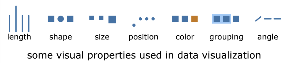
There are many components to this visual language including length, shape, size, position, color, grouping, angle, and other characteristics.
Each chart type uses these components in a slightly different way. Once you know how to read one type of chart, that may be a clue in reading other new types of charts, but some charts are not necessarily intuitive to read, especially if they try to represent too many different types of information. Simplicity in a chart is one of the keys to making it accessible to everyone.
Each of these components provides affordances to the data. An affordance is a clue about how an object should be used or understood and are typically some built-in characteristic of the object or its context. For example, a light switch provides a set of affordances that let you know what it is and how to operate it: it protrudes from the wall; it's angled up or down; it moves easily when you push it; it snaps into only one of two positions; and it activates or deactivates the light immediately when you've changed it. Because we tend to understand length as a measure of a numerical quantity (think of that thermometer or of a person's height as a general measure of their age), the length of a bar in a bar chart, along with its label (x-axis) and a scale of value ranges (y-axis), provides an affordance for the value of that piece of data.
Each type of chart is good at letting you answer a different set of questions about the data it represents or perform a different set of tasks with that data. A bar chart helps you find the difference in values for a set of categories. A line chart helps you understand changes over time. A pie chart helps you understand the relative proportion each category contributes to the whole. A flowchart helps you follow a set of choices from the start to a particular conclusion. When you look at the chart, ask yourself, "What is this chart trying to explain to me, and how is it doing that?" When you really understand how to read a chart, then you can understand when to use each type of chart and how to create one yourself to help you explain an idea to others, or even how to think about it more systematically yourself.
Why are Accessible Data Visualizations Important?
In today's world, we have more information than ever, and people can get overwhelmed in picking the right information to make decisions about topics small and large, trivial and important. To address this information overload, many authors are turning to data visualizations to help impart information quickly and easily. Because data visualizations are more common than ever, with more information locked away in a visual form, it's important that everyone, even people with disabilities, learn to read charts, and it's equally important that charts are made accessible.
Reading charts is a skill students need to learn, and one that adults need to live productive lives in many environments. Charts and graphs are common in workplace environments, on government websites, in financial and healthcare reports, and in many other aspects of everyday life, where people need to make informed decisions.
What Techniques are Available?
Textual
This medium serves the needs of both screen-reader users and braille readers. Textual descriptions can be either high-level summaries or detailed explorations. Text summaries that simplify the data can also serve students with cognitive disabilities.
Using text, it is relatively easy to give access to individual data points, but the challenge lies in providing a meaningful overview. Here are some of the techniques for providing textual data:
- Data tables:The raw data in tabular form is the bare minimum that should be provided. With a data table, a screen-reader user can get all the information, if not the overall intent or trend. For this higher-level information, you can provide a manual or automatic summary.
- Manual:When providing a meaningful human-generated overview of a chart or diagram, you can follow the techniques for complex image description provided by the W3C or other resources.
- Automatic:Some software, described below, can provide automatic descriptions or summary statistics of charts and diagrams. While this is unlikely to be as high-quality as a human-generated description, it is especially useful for dynamic data that is generated in real time.
Tactiles and Haptics
Tactiles and haptics are techniques that use touch to represent information. Basically, tactiles are physical objects or raised surfaces, while haptics are active touch-based feedback. The website TactileGraphics.org gives helpful details on creating tactile graphics.
- Embossers:An embosser is a special kind of printer that outputs paper with raised features on the surface that the reader can feel and explore. This may include both images and braille text. Some embossed paper can be overlaid on a touch screen for more interactivity. Embossers are very effective, but can be expensive and require preparation time. To offset the cost of an embossing printer, a school district might share a common embosser that's used among all its schools.
- Swell paper:Swell-touch paper is a special paper on which images can be printed or drawn and made into tactile diagrams. Images, braille, or text are inscribed in black ink onto the paper with a printer, photocopier, or pen. Then the paper is heated using a special machine (often referred to as a fuser), and the black parts of the image swell up to become tactile. This process results in a diagram that can be interpreted using touch or vision. As with an embosser, these diagrams can be made interactive by overlaying them on a touch screen. Swell paper is somewhat expensive, as is the fuser.
- Vibrating touchscreens:Touchscreen tablets and phones are commonly available, and many have a small electric motor that can provide a physical vibration when the user touches select parts of the user interface. Such devices are typically inexpensive, and the software can update the screen quickly, but they lack the precision for distinct textures.
- Refreshable pin displays:Like a large braille display, these tablets have pins that are raised or lowered to show textures, and they can change dynamically and be interactive like vibration-based touchscreens. Unlike vibration-based touchscreens, these tablets have a higher degree of precision, with several pins per area unit, and variable height for each pin. However, such devices are still typically expensive.
- 3D printers:Affordable, easy-to-use 3D printers have recently become available. Like embossers, these can provide a physical tactile experience with a fair amount of precision. There are many libraries of free or inexpensive 3D-printable shapes that can be used in a classroom, including Benetech resources such as Imageshare. A school or district may buy its own 3D printer or get access to one through a local university or maker shop.
See Appendix 2: Haptic and Tactile Products for more information on tactile products and companies producing them.
Sonification
Sonification is the non-speech representation of data. For example, a Geiger counter or an electrocardiogram heart-rate monitor are common examples of sonification. A line graph might be represented by a rising or falling tone, or each bar in a bar chart might play a particular note on a musical scale. For more about sonification, read the sonification chapter in this report.
Scalable Vector Graphics (SVG) Image Format
Scalable Vector Graphics (SVG) is not a technique, but rather a medium for data visualization. SVG is a web language for graphics. This format is commonly used for modern data visualizations on the web because of its versatility. It can be either static or interactive; it can zoom in or out, get bigger or smaller, with no loss of crispness (unlike raster formats like JPG or PNG); and it can be generated dynamically in a browser or pregenerated and downloaded from a server. It can even be used as a local file that opens in a web browser.
SVG is like HTML for graphics, and like HTML has text that can be read by assistive technology (AT). It also has advanced metadata capabilities and allows the use of ARIA (Accessible Rich Internet Application) markup attributes (like HTML). Using these techniques, you can create SVG documents that allow AT users to navigate around a chart or diagram in the same way they could navigate an HTML page. SVG's zooming capability is especially important for low vision users who benefit from sharp, precise images when fully zoomed in. We describe low-vision techniques in detail later.
SVG accessibility techniques
If you have the technical skill to create SVG files yourself, here are some specific guidelines to making them accessible. If you are looking for deep technical details, see Appendix 3: Technical Details for Creating Accessible SVGs.
Who is Doing it Already?
A number of software products, both free and commercial, focus on making accessible data visualizations. While most of these software products produce data visualizations for the web, in most cases, they will also work as local files on your computer when opened in a web browser. For a list of products that create or display accessible content, see Appendix 4: Accessible charting software and products.
In addition, there are emerging computer vision apps, such as Microsoft's free Seeing AI app, which attempt to describe images and scenes through machine learning. Soon, these will be able to describe charts and allow the user to explore them with reasonable reliability, and they are worth testing right now.
How Can it Be Used in the Classroom?
In order for all students to attain the same skill acquisition as their peers, data visualization skills should be taught early, with adaptive reinforcement throughout their education career.
Teachers need to meet two goals:
- Make sure that graphical content is presented in a way that students can read the information, such as through text, voice, or Braille.
- Ensure that the students understand the forms, varieties, and details of data visualizations themselves so they can collaborate with their peers.
Challenges and Opportunities for Students with Disabilities
As children enter their teen years, they may be more resistant to using tactile materials, associating them with younger kids' activities. They will also be learning more complex subjects that need greater precision. This is a good time to introduce them to more advanced software-based solutions using AT.
In many cases, students with disabilities will still need extra time to accomplish some tasks with data visualizations, even with advanced software. Accommodate this need for more time in both training and assessment, in order to give them the necessary skills and the chance to demonstrate them.
In some cases, the software may provide too much information in automatically generated summaries (such as the average or total of a bar chart data set). You may need to select software that can be customized to reduce the amount of information provided for assessment purposes or to think of different tasks for assessment criteria.
Making Data Visualizations Accessible
As William Playfair observed, our brain often understands visual relationships better or faster than it understands numerical ones. This makes the visual medium especially powerful.
But not everyone can take advantage of a data visualization in the same way. A person with color blindness might not be able to tell the difference between two different bars if the creator of the chart wasn't careful in her use of colors. Someone with a cognitive disability might not be able to easily make the connection between the position of a dot on a plot and the numerical number, even if they could understand the same information in a data table, or they might be overwhelmed by seeing all the different components together. A person with low vision might have to zoom into a chart and pan around it to see each component and thus not be able to get the sense of the big picture. And, of course, a person with no sight at all can't perceive a visual-only chart, so the data is hidden from them.
So, when you're making a chart, you need to consider the information you're trying to convey and provide a different set of affordances to convey that information to users with different disabilities.
There is no one-size-fits-all solution to making a chart accessible. For color blindness, picking the right colors or different fill patterns is usually enough. For people with cognitive disabilities, providing the information in a different form, such as a data table or an explanatory paragraph will often help. For a low vision user, making sure each element has an optional label even when zoomed in may provide enough context. For a blind user, providing the information in a data table is a good start, though making the data available in the chart itself is even better, and providing summaries (either handcrafted or automatically generated) with selected highlights can give an effective overview.
We'll describe a few details about ways to make data visualizations accessible in this chapter.
However, all of this can be complicated and time-consuming. Because most charts are generated by software, your best option is to pick of piece of software that produces charts that are accessible.
Early Education
Reading charts is a skill that's typically taught to children starting around third grade (for example, see the tasks taught in the US Common Core standards for that grade level). This standard may be a challenge for TVIs (teachers of students with visual impairments) to teach equivalent skills, or rather, to teach the same skills through an equivalent medium.
Low Vision
Students with low vision should be taught how to use screen magnification software, giving them the skills to orient themselves within a frame of reference and to selectively use zooming and panning to selectively get the bigger picture and the details of a chart or diagram. Skilled users with low vision often alternate between zooming out to get an overview, then zooming in to read and see detail, then zooming out again to find a new reference point. Many people with low vision use a combination of a magnifier and a screen reader, and they may also use tactiles to reinforce a visual representation or to explore a visualization for outliers or points of interest.
To enable this behavior, data visualizations should use focus indicators (such as an outline or color change) to provide a reference point when users zoom in and out or pan to read or get more context.
Profound Visual Impairment
Many students react well to sound- and tactile-based interaction with a tablet. Some tablet- or web-based software can help blind students with charts and graphs. Tactile models can be an effective and low-cost way to teach young students to understand and create charts. A TVI can use a braille label maker to add numbers and letters to building blocks (such as Lego™-brand blocks), then teach them to build a set of stacks to represent a bar chart.
A non-tactile technique is to use a basic sonification (see the chapter on sonification for more in-depth information). For example, a teacher could represent a bar chart as a series of musical notes, where each bar is represented as a particular note, and the number of repetitions of that note indicate the value of that bar (e.g., repeating the note C four times shows a value of 4).
Mixing different senses and modalities can help students find their preferred way of learning and can reinforce the lessons to develop a proper sense of abstraction.
Cognitive Disability
Teachers should identify students who are having an unusual difficulty in learning to use data visualizations and offer multiple alternatives to see if the student has a preference or particular aptitude. See the chapter on multimodal for additional information on alternative formats. Establishing what works for different students will empower them to show initiative in selecting the right learning tools for themselves in the future.
Higher Education
Higher grade levels present their own challenges, such as mathematical graphing and other complex, intricate tasks.
Low Vision
Advanced students with low vision should already be familiar with the basic techniques for using magnifiers and tactiles, so teachers should introduce more advanced techniques. This includes how to read Cartesian mathematical graphs with a zoom-in-and-out technique, and interpreting complex tactile graphics with a tour of major features, starting with the context (such as the title and axes) and proceeding through each data point.
Profound Visual Impairment
The use of interactive, self-describing charts and diagrams and haptic tablet solutions are likely to yield the best results for older students.
Cognitive Disability
For students who have difficulty with the abstract notion of charts or who find charts too cluttered, providing them with self-voicing charts or textual descriptions, or giving them the ability to reduce the number of elements pictured, may help in overcoming and addressing certain cognitive disabilities.
Case Studies or Examples of What is Being Done for Special Populations
One technique used by teachers of students with visual impairments is to give the student a fun and physical way to represent data. To show how a line chart works, the TVI provided pushpins, string, and a piece of poster board or cardboard with a raised grid (made from lines of glue), with the x and y axes labeled with braille or raised symbols. They taught the students to plot a series of x and y values on the board using the pushpins, then they joined those together with the string. This technique allowed the student to explore the changes over time in a tactile way, feeling how the string went up or down.
Conclusions/Actions for Parents, Educators, and Students
In the past, there has been a misconception that data visualizations are not able to be made accessible. This attitude locked many people with disabilities out of critical decision-making information. With recent innovative approaches by software developers, charts and diagrams no longer have to be a mystery to students. Apply imagination to the problem, and where possible use the hardware and software solutions that are increasingly available, and students with disabilities can attain mastery of data visualization. Knowing that it's possible to make such material accessible, you can advocate for its adoption and use not only in the classroom, but also in the work environment, to give people with disabilities a level playing field in the job market.
Callout for Teachers
Data visualizations and diagrams are an increasingly important part of STEM education. You are likely to encounter charts, graphs, or infographics that you didn't create. Publishers and curricula creators should be aware of the legal requirements for equal access, and if they are not proactive in meeting those needs, they are creating more work for you. When you encounter inaccessible materials, ask the publisher or creator: What can and will you do to make the content available to people with disabilities? Make them aware of this report, if they need help.
Having the materials available and making sure the student understands and can use them is the first step. They also need to be able to talk about them with their peers (and later their workplace colleagues). Make sure that the student has the vocabulary to describe and discuss graphical content and the ability to create data visualizations themselves to present information to others.
Callout for Parents
Without a grounding in how information is presented visually, your child will have gaps in his ability to collaborate with fellow students and coworkers. Insist that teachers and administrators not only present data visualizations in another form, but that they teach your child the forms of data visualization and how to discuss and create data visualizations. Ask them: How are you preparing my child to operate in the business world? What materials can you provide that give my child independence? Which publishers are you using to provide universal access?
Callout for Students
Charts, graphs, and diagrams may not seem as useful to you as text information, and they may even be hard for you to learn and understand. However, they are very common, and they help most people to quickly understand data. So, rather than avoid them in favor of text equivalents, you should learn to create a mental model for how the data is being presented, so you can operate on the same level and with the same proficiency as your friends and coworkers. You will find that many people respond better to data visualizations than to textual data, so you should find and learn how to use software that enables you to create data visualizations. Ask your teachers and your peers: Can you explain the visual aspects of the graphic to me in detail, so I can understand how to build them myself?
Appendix 1: Code Samples
The code examples shown here have the styling embedded inline within the SVG/HTML code for simplicity, this can and should be pulled out into a separate CSS file.
Code for Accessible SVG Bar Chart
<svg xmlns="http://www.w3.org/2000/svg" xmlns:xlink="http://www.w3.org/1999/xlink"
width="100%" height="100%" viewBox="10 10 510 350">

    <title>Total declaring one or more disabilities: 18.6% Sensory (visual and hearing): 2.3%
    Physical: 6.2% Mental: 3.8% Self-care: 1.8% Difficulty going outside the home: 6.4%
    Employment disability: 11.9%</title>

    <style>
        text
        {
            font-family: "Lucida Grande", Verdana, Arial, Helvetica, sans-serif;
            fill: black;
        }
        rect
        {
            stroke: black;
        }
    </style>

    <text id="title" font-size="14.5" font-weight="bold"
    text-anchor="middle" fill="red" tabindex="0">
        <tspan x="270" y="36" text-anchor="middle">
            Percentage of Total Noninstitutionalized Population</tspan>
        <tspan x="270" dy="1.2em" text-anchor="middle">
            Age 16-64</tspan>
        <tspan x="270" dy="1.2em" text-anchor="middle">
            Declaring One or More Disabilities</tspan>
    </text>

    <rect id="graph-bg" x="69" y="84" width="280"
        height="245" fill="#C0C0C0" />

    <g id="bars" stroke-width="1.5">
        <rect id="bar-1" x="93" y="101" width="33" height="228" fill="#9A99FF" />
        <rect id="bar-2" x="126" y="301" width="33" height="28" fill="#993365" />
        <rect id="bar-3" x="159" y="253" width="33" height="76" fill="#FFFFCB" />
        <rect id="bar-4" x="192" y="282" width="33" height="47" fill="#CCFFFF" />
        <rect id="bar-5" x="225" y="307" width="33" height="22" fill="#660066" />
        <rect id="bar-6" x="258" y="250" width="33" height="79" fill="#FE8081" />
        <rect id="bar-7" x="291" y="183" width="33" height="146" fill="#0066CB" />
    </g>

    <g id="legend">
        <rect id="legend-1" x="361" y="99" width="6.25" height="6.25" fill="#9A99FF" />
        <rect id="legend-2" x="361" y="132" width="6.25" height="6.25" fill="#993365" />
        <rect id="legend-3" x="361" y="165" width="6.25" height="6.25" fill="#FFFFCB" />
        <rect id="legend-4" x="361" y="198" width="6.25" height="6.25" fill="#CCFFFF" />
        <rect id="legend-5" x="361" y="231" width="6.25" height="6.25" fill="#660066" />
        <rect id="legend-6" x="361" y="264" width="6.25" height="6.25" fill="#FE8081" />
        <rect id="legend-7" x="361" y="297" width="6.25" height="6.25" fill="#0066CB" />
    </g>

    <g id="axes" text-anchor="middle" font-weight="bold" font-size="11">
        <text id="x-axis_label" x="208.5" y="348" tabindex="0">
            <tspan font-size="0">X Axis:</tspan>
            Types of Disability
        </text>

        <text id="y-axis_label" x="23" y="206" transform="rotate(-90,23,206)" tabindex="0">
            <tspan font-size="0">Y Axis:</tspan>
            Percentage of Total <tspan x="23" dy="1em">
            U.S. Population</tspan> <tspan x="23" dy="1.1em">(178,687,234)</tspan>
        </text>

        <text id="y-axis_ticks" font-size="10" font-weight="normal"
        fill="black" text-anchor="end" tabindex="-1">
            <tspan x="61" y="332">0</tspan>
            <tspan x="61" y="308">2</tspan>
            <tspan x="61" y="283">4</tspan>
            <tspan x="61" y="258">6</tspan>
            <tspan x="61" y="234">8</tspan>
            <tspan x="61" y="209">10</tspan>
            <tspan x="61" y="185">12</tspan>
            <tspan x="61" y="160">14</tspan>
            <tspan x="61" y="136">16</tspan>
            <tspan x="61" y="112">18</tspan>
            <tspan x="61" y="87">20</tspan>
        </text>
    </g>

    <g id="labels" font-size="10">
        <text id="label-1" x="370" y="106" tabindex="0">
            Total declaring one or more
            <tspan x="370" dy="1.1em">disabilities</tspan>
            <tspan x="109.5" y="95" text-anchor="middle">18.6%</tspan>
        </text>

        <text id="label-2" x="370" y="139" tabindex="0">
            Sensory (visual and hearing)
            <tspan x="142.5" y="295" text-anchor="middle">2.3%</tspan>
        </text>

        <text id="label-3" x="370" y="172" tabindex="0">
            Physical
            <tspan x="175.5" y="247" text-anchor="middle">6.2%</tspan>
        </text>

        <text id="label-4" x="370" y="205" tabindex="0">
            Mental
            <tspan x="208.5" y="276" text-anchor="middle">3.8%</tspan>
        </text>

        <text id="label-5" x="370" y="238" tabindex="0">
            Self-care
            <tspan x="241.5" y="301" text-anchor="middle">1.8%</tspan>
        </text>

        <text id="label-6" x="370" y="271" tabindex="0">
            Difficulty going outside the
            <tspan x="370" dy="1.1em">home</tspan>
            <tspan x="274.5" y="244" text-anchor="middle">6.4%</tspan>
        </text>

        <text id="label-7" x="370" y="304" tabindex="0">
            Employment disability
            <tspan x="307.5" y="177" text-anchor="middle">11.9%</tspan>
        </text>
    </g>

</svg>
Code for Heatmap Chart
<!DOCTYPE html> <html> <head> <meta charset="utf-8"> <title>Heatmap example</title> <style> table { border-collapse: collapse; border: 1px solid gainsboro; } th, td { text-align: center; padding: 0.25rem 0.5rem 0.25rem 0.5rem; border: 1px solid gray; } .hot { background-color: #ef8a62; } .warm { background-color: #fddbc7; } .moderate { background-color: #f7f7f7; } .cool { background-color: #d1e5f0; } .cold { background-color: #92c5de; } </style> </head> <body> <h1>Heatmap example</h1> <table> <caption>Average Boston temperatures</caption> <thead> <tr> <th scope="col"> </th> <th scope="col">Jan</th> <th scope="col">Feb</th> <th scope="col">Mar</th> <th scope="col">Apr</th> <th scope="col">May</th> <th scope="col">June</th> <th scope="col">July</th> <th scope="col">Aug</th> <th scope="col">Sept</th> <th scope="col">Oct</th> <th scope="col">Nov</th> <th scope="col">Dec</th> </tr> </thead> <tbody> <tr> <th scope="row">High °F</th> <td class="cold">36</td> <td class="cool">39</td> <td class="cool">45</td> <td class="moderate">56</td> <td class="warm">66</td> <td class="warm">76</td> <td class="hot">81</td> <td class="hot">80</td> <td class="warm">72</td> <td class="moderate">61</td> <td class="cool">52</td> <td class="cool">41</td> </tr> <tr> <th scope="row">Low °F</th> <td class="cold">22</td> <td class="cold">25</td> <td class="cold">31</td> <td class="cool">41</td> <td class="cool">50</td> <td class="moderate">60</td> <td class="warm">65</td> <td class="warm">65</td> <td class="moderate">57</td> <td class="cool">47</td> <td class="cold">38</td> <td class="cold">28</td> </tr> </tbody> </table> </body> </html>
Appendix 2: Haptic and Tactile Products
ViewPlus
Embossing printers and hardware and software to create tactile
graphics for blind and low vision students, including their IVEO
tablet-based system for overlaying embossed materials on
interactive tablets.
Creator: ViewPlus
Website: viewplus.com
Vital
Tablet-based interactive tactile graphics software for blind and
low-vision students, focused on the education market.
License: commercial
Creator: Vital
Website: www.vital.education
American Thermoform
Swell form graphics machines (fusers) and paper to create
tactile graphics for blind and low-vision students.
Creator: Zychem Ltd
Website: www.americanthermoform.com
Appendix 3: Technical Details for Creating Accessible SVGs
To make an SVG-based data visualization accessible, you have to follow a few basic tenets:
- Make sure text is text:It's possible in SVG to make a passage of text into an image that isn't readable by AT. Some authoring tools may do this without warning, especially if you're using an unusual font or have transformed the text in some way. Check to make sure that the text has been preserved as text.
- If the text has been converted into an image and needs to stay as an image to achieve a particular visual effect, make sure to provide a metadata equivalent in that <text> element's child <title> element.
- Create a logical structure:SVG has a <g> element for grouping, like a <div> in HTML or a layer in Adobe Illustrator. You can use this element to group similar items together, such as a separate group for each axis and its constituent parts (i.e., lines, tick marks, labels), a group for all data points, and a nested subgroup for each data point if it has more than one element (i.e., a dot and a line for a line chart data point or a bar and its label for a bar chart). This will make navigation easier for the user.
- Maintain document reading order:When creating an SVG document manually in many SVG authoring tools, such as Inkscape or Adobe Illustrator, the text and metadata are added to the document in the order in which you create them, which may not be the order you intend them to be read. The same may apply when you're generating SVG programmatically. Make sure to check the reading order to ensure it makes sense. In SVG authoring tools, you can rearrange layers to properly order the content. An easy test of text order is to select all in the document and paste it into a blank text document; this step will show the reading order of the text. Even better, you can step through the document with a screen reader to confirm that everything is in the right order and makes sense.
- Establish context:Before providing the data, make sure that you set the stage for the reader to understand and interpret it. Provide the chart title first, then a summary, and then the axes or legend items (for categories or value ranges) before presenting the individual data points.
- Include the data:Make sure that each data point has its data value included as either a <text> element or an appropriate metadata element, such as <title>.
- Note that when using a <title> element, you should give it a title attribute and point to that element with an aria-labelledby attribute in its parent. This is for compatibility with older browsers.
- Use ARIA attributes as needed:ARIA does not define roles, properties, or states for data visualization, but there are a variety of UI semantics you can use, including table cells, groups, and so on. At the time of writing, browser and AT support is not consistent for ARIA in SVG, but we are working to improve it.
- Make key elements focusable:By default, only text and links are focusable in SVG for keyboard navigation (i.e., using the tab key). In order to make the important elements of an SVG focusable, you must add the tabindex="-1" attribute value to the element in question. You must also make its parent element focusable with the same attribute, or the element might be ignored.
Appendix 4: Accessible Charting Software and Products
Many products provide the ability to create or consume accessible data visualizations. The following are a representative sample at the time of publication.
It is relatively common for a product to include a color-blind-safe palette, but this feature only addresses one set of disabilities. The following software projects have taken steps to make their software more accessible (note that this list is not exhaustive).
Fizz Charts
A commercial, JavaScript-based web charting program that creates
the most common charts (e.g., bar, pie, line, stacked bar,
scatterplot, map) with a GUI authoring tool. Accessibility is
provided through a screen reader.
License: commercial; free for some uses
Creator: Fizz Studio
Website: www.fizz.studio
HighCharts
A commercial, JavaScript-based web charting program that creates
a full-featured set of charts and graphs with a GUI authoring tool.
Accessibility is provided through a screen reader.
License: commercial; free for some uses
Creator: HighSoft
Website: www.highcharts.com
SAS Graphics Accelerator
A free, JavaScript-based web charting program that uses
sonification to let the user explore the most common chart types
(e.g., bar, line, pie) with a menu-based accessible authoring tool.
License: commercial; free for some uses
Creator: SAS
Website: support.sas.com/software/products/graphics-accelerator
Semiotic
A free, open-source, JavaScript-based web charting program that
creates a full-featured set of charts and graphs for programmers.
Basic accessibility is provided through a screen reader for some
chart types.
License: open source and free
Creator: Elijah Meeks
Website: semiotic.nteract.io
APH Graphiti
A refreshable display tablet with a large area of
variable-height pins that can display pie charts, bar graphs,
geometric forms, maps, floorplans, flowcharts, line drawings, and
dynamic graphical content.
Creator: American Printing House for the Blind
Website: www.aph.org/graphiti/
Canute 360
A multiline, braille e-reader with nine lines of 40 braille
characters that can display basic tactile graphics as well as all
six-dot braille codes (including music, math, and foreign
languages).
Creator: Bristol Braille Technology
Website: www.bristolbraille.co.uk
References
- Playfair, W. (1805). An Inquiry into the Permanent Causes of the Decline and Fall of Powerful and Wealthy Nations. Designed To Shew How The Prosperity Of The British Empire May Be Prolonged. London: W. Marchant.
- William Playfair. 2019. Retrieved from https://en.wikipedia.org/wiki/William_Playfair#Bar_chart on July, 2019
Published: 2019-08-31